The works of designers and creative or cultural workers shape the identity of our cities.
The purpose of this competition is to produce images that illustrate what has made, makes or will make Berlin, Buenos Aires, Kobe, Montréal, Nagoya, Shanghai and Shenzhen unique.
Every metropolis has its own visual identity, an individual CODE. The focus of this competition is: What CODE defines each city? What is your image of Berlin, Buenos Aires, Kobe, Montréal, Nagoya, Shanghai or Shenzhen?
Through this poster competition, together with thousands of creative minds internationally, we want to depict symbols, forms, colours and stories in the urban landscapes that make Berlin, Buenos Aires, Kobe, Montréal, Nagoya, Shanghai and Shenzhen UNESCO Cities of Design.
The competition aroused great interest among designers in the seven participating cities. More than 1,400 registrations were received, and 807 poster designs were eventually submitted. Designers were invited to visually define the identity of one of the UNESCO Cities of Design while at the same time evoking the singularities of each.
A jury made up of five design professionals, among them an expert from Nagoya and Shanghai selected 10 finalist designs from among the submitted works, including a Grand Prize winner. The evaluation criteria included how well the originality and creativity of the concept was expressed through solid design principles, the degree of the design’s relevance and connection to the competition theme, and how well the design could be adapted, in whole or in part, to other applications, formats or merchandise products.
The winners of the CODE Nagoya competition are:
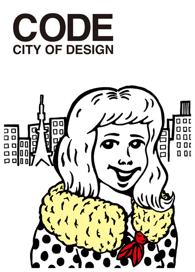
Ebifry (deep-fried prawn) scarf
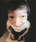
Ryohei Sugiura
I wanted to make a poster with impact, one that will make people wonder, “what’s THAT?” and then look more closely. Also, since the selected posters will be exhibited in the seven Design Cities, I wanted to introduce Nagoya as a unique Design City to a broad audience. As I was searching for an interesting identity, I realized that Nagoya has developed a singular food culture, so for the motif of my poster, I chose an illustration of a woman with an Ebifry scarf, featuring this special Nagoya treat.
Ryohei Sugiura
Illustrator
Award
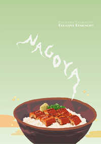
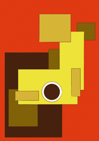
A local specialty, Hitsumabushi
Miki Ihara
When I thought about the famous cuisine in Nagoya, the first thing that came to my mind was Hitsumabushi (grilled eel on rice). Therefore, while using Hitsumabushi as the main motif in this poster, I placed it at the bottom so that the image would not overwhelm viewers. Also, I felt that it would appear simple and boring if steam from the Hitsumabushi were depicted in its natural form. Furthermore, I wanted to include the word “Nagoya” in my poster. Therefore, I designed the steam to form the word “Nagoya”.
Center of Japan
Toshihumi Iwase
Shachihoko, the symbol of Nagoya, is designed to resemble a map of Japan. In this design, the eye of Shachihoko appears to be in the center of Japan. To emphasize the simple strength of Nagoya, I used colors that closely resemble those used in the clothing of victorious warlords from the Warring States period in Japan. Using Shachihoko as the main motif creates a symbol that enables people to recognize Nagoya at a single glance. The design also expresses my hopes that people will feel the history of Nagoya and that Nagoya will continue to be the creative and innovative center of Japan.
*Shachihoko: a fabulous dolphin-like fish (a pair of which were traditionally used to decorate the roof‐ridge of a Japanese castle).
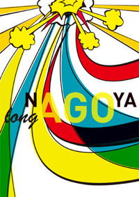
NAGOYA LONG AGO
Takahiko Kito
I believe that Nagoya is a city that is conscious of its history, yet at the same time is fettered by that history. In order to be granted the new symbol “City of Design”, I feel that we have to destroy the meaning of “history” and reconstruct a new meaning for it. The pop illustration and the phrase “NAGOYA LONG AGO,” formed by extracting the word “AGO” from the word “NAGOYA,” is designed to represent Nagoya’s power to reconstruct the meaning of history, and not to deny its ability as a city of design.
Marble City
Masatoshi Suzuki
This poster is inspired by rain and water droplets as it was the rainy season when the poster was produced. I colored the words grey and the Shachihoko white in reference to Nagoya’s image of solidity and its lack of glamour when compared to other metropolitan areas like Tokyo and Osaka. I also wished to express the dull and cloudy skies of the rainy season.
*Shachihoko: a fabulous dolphin-like fish (a pair of which were traditionally used to decorate the roof‐ridge of a Japanese castle).
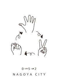
Idea from 052 NAGOYA
Hiroyuki Tange
Nagoya’s area code is 052. I defined the theme CODE as new idea. When stuck in a dead-end with the idea “0” (rock), open up fresh possibilities with the new idea “5” (paper). Similarly, when thinking is stalled with idea “5” (paper), carve out another path with the new idea “2” (scissors). Nagoya has developed by repeating such a process of ideas. The area code of the City of Nagoya is 052. The ideas transmitted from this area code have made Nagoya into the prosperous city that it is today, and these ideas will continue to propel Nagoya forward. This is the identity of Nagoya.
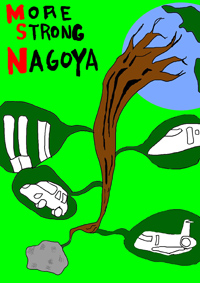
Stronger Nagoya
Kei Fujita
The concept of the poster is the industries that Nagoya takes pride in. Regardless of the materials, Nagoya is capable of transforming them into useful products. This poster shows that even if the material is a rock, Nagoya has the power to turn it into wonderful things. It wouldn’t be an exaggeration to say that this power of Nagoya is supporting the world today.
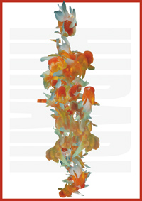
HIRARI
Yoko Mazuki
Nagoya, a metropolitan city with an international airport and a commercial harbor open to the world, has developed through the often unnoticed yet highly important support of manufacturing industries. On the other hand, Nagoya has a relaxed and easy atmosphere. I think that this relaxed atmosphere cultivates in people a rich sensitivity and flexibility for paying attention to life’s tiny details and creating ideas from them. Hirari means lightly or nimbly.
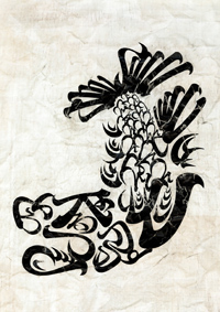
Golden Shachihoko
Masatsugu Yano
I broke down the Kinshachi font, which is a font in the image of Nagoya, and rearranged the pieces into a drawing. In this piece, I disassembled the name of Tokugawa Ieyasu and rearranged the pieces to form the Golden Shachihoko of Nagoya Castle.
*Nagoya Castle was built by Tokugawa Ieyasu as his last strategic move in the unification of Japan.
*Shachihoko: a fabulous dolphin-like fish (a pair of which were traditionally used to decorate the roof‐ridge of a Japanese castle).
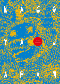
NAGOYA JAPAN
Mitsuo Watanabe
I defined the CODE of Nagoya as the signs of history, from a war-torn era to the modern era. I have expressed the vitality of Nagoya from the perspective of a young child.
In a competition with the theme CODE (sign/symbol), for which many entries symbolized the meaning of “city”, the ebi-fry, or deep-fried prawn, won praise for the intuition of that choice. One of the essential aspects of design is the power to render abstract conceptions. Another is a sense of humor. This piece took the top prize because the competition focused on the city of Nagoya.
The girl luxuriously wrapped in a scarf of ebi-fry (a food with a privileged position in Nagoya), with its strange feeling of the enigma of the gorgeous and the tawdry, symbolizes the culture of this city. [Editor’s note: Fried prawn is a favorite food of Nagoyans that was once a symbol of luxury.] From the point of view that the entity of Nagoya can be related to something humorous and ever changing, rather than something eternally grand, the winning piece expresses the crisp character of Nagoya’s vital populace. In that sense, it deftly depicts Nagoya now.
This occasion offered us an opportunity to have another look at where we live. It was very interesting for me to find that each and every one of the contestants has a different image of Nagoya. If I may venture to make one more comment, I would ask the contestants to be more aware of the scale of the paper stipulated for this project.
Shin Sobue
We must mention that many entries used stereotypical motifs, including the Golden Shachihoko (an imaginary fish set at the roof ridges of the symbolic Nagoya Castle). I believe that if an image, however stereotypical, precisely represents Nagoya, it’s quite all right to use it, for any number of years. Every work aroused my interest in how it successfully finds common ground with the present.
Akira Tatehata
This was a good competition, as it helped bring up memories of one’s own hometown. There have been many launches of projects directed outward, but the content of this competition served in the reexamination of one’s own position or something like the fundamental meaning of the place.
Masaaki Hiromura
In what way do you expect to depict your own town? How do you expect your town to be depicted or publicized? We shouldn’t be satisfied with the success of this one competition, which produced a lot of good artwork; we should continue to hold this kind of competition, like a treasure hunt. This will help us find something viable.
Shunyo Yamauchi
The 10 winning posters in the Nagoya CODE competition will be exhibited at Design Gallery, International Design Centre Bldg., from 9 to 17 October 2010.
All 70 selected poster designs will also be included in a group exhibition to be displayed in each of the UNESCO Cities of Design between September 2010 and December 2011, and showcased on the websites of the participating cities.
In addition, each of the seven Grand Prize winners will receive a cash award of JPY200,000 (US$2,000) and a UNESCO medal.
To view the winning designs in the other cities’ competitions, visit the websites listed below:
CODE BERLIN | www.create-berlin.de
CODE BUENOS AIRES | www.code.buenosaires.gob.ar
CODE KOBE | www.ithinkobe.jp/kobe-code
CODE MONTRÉAL | www.realisonsmontreal.com
CODE NAGOYA | www.creative-nagoya.jp/code
CODE SHANGHAI | www.scic.gov.cn, www.021ci.com
CODE SHENZHEN | www.shenzhendesign.org
Established in October 2004, the UNESCO Creative Cities Network seeks to facilitate and promote exchanges of best practices and know-how among cities that have creativity in common and, as a result, help spur their development via international networking.
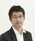
Masaaki Hiromura
Art Director / Graphic Designer / Professor of Faculty of Arts, Tokyo Polytechnic University
1954: Born in Aichi Prefecture. Entered Tanaka Ikko Design Office in 1977, established Hiromura Masaaki Design Office in 1988.
Major work includes signage systems for Nissan Motor Design Center, Yokosuka Museum, Nomura head office building, 9 h nine hours Kyoto Teramachi, Iwadeyama Junior High School and Saitama Prefectural University, UI, Future University-Hakodate, CI & signage system for the National Museum of Emerging Science and Innovation, VI & signage system for CODAN Shinonome, annual advertising plan for Marunouchi building, and the logo mark for the 1300th Anniversary Program of the Relocation of the Capital to Heijokyo.
2007: 2D-3D Solo Exhibition at Ginza Graphic Gallery, 2008: Mainichi Design Awards
President, Hiromura Masaaki Design Office
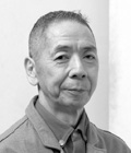
Shin Sobue
Book Designer
1959: Born in Aichi Prefecture. Left the graphic design department of Tama Art University to act as an independent art director. Currently he runs the design office cozfish. With an uncommon ability to enchant, regardless of the type of print media, Sobue has long been at the forefront of book design. His work encompasses a broad range of genres, including picture books, novels, manga and photography books. Shin Sobue + cozfish, comprising Sobue’s work to date, is due out shortly from PIE BOOKS (Tokyo).

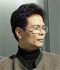
Akira Tatehata
Artistic Director for the Aichi Triennale 2010 / Director of the National Museum of Art (Currently President of Kyoto City University of Arts)
1947: Born in Kyoto. In 1972, graduated in French Literature from Waseda University’s School of Letters, Arts and Science. From 1972 to 1976, Tatehata worked for the art editorial department at SHINCHOSHA Publishing Co., Ltd. Tatehata’s distinguished career has included service as head curator at National Museum of Art, Osaka (1977-1989), assistant professor and professor at Tama Art University (1989-2005), and visiting scholar at Columbia University (2001-02). Since 2005, he has been Director of the National Museum of Art, Osaka and a guest professor at Tama Art University. In 1991 and 1993, Tatehata was the Japanese Commissioner for La Biennale di Venezia. He also acted as the Artistic Director for the 2001 Yokohama Triennale. As a poet, Tatehata was awarded the Rekitei New Poet Prize in 1991 for "Yohaku no Runner" (Runner in the Margins) and the Takami Jun Prize in 2004 for his work "Reido no Inu" (Dog at Absolute Zero).
Shunyo Yamauchi
Graphic Designer
1949: Born in Aichi Prefecture. 1970, 1971: Graduated from the Commercial Design Course of Toho Gakuen Junior College and its graduate course, respectively. In 1979, he established Shunyo Yamauchi Design Office, after working for Shigeo Okamoto Design Office and the design office Zima. Awards received include, in 1983, the first NAAC Exhibition Encouragement Award, the first JAGDA New Designer Award, the 1983 Japan Design Committee Design Forum Bronze Medal Prize and The Governor Award of Aichi Prefecture for the 8th Aichi Advertising Association Award. He received the same award in the 13th year (1988), and in 1998, the Printing & Publishing Institute Prize at the 40th Catalogue and Poster Fair.
Lin Jia Yang
Professor, School of Creative Design, Tongji University
Chairman of Visual Arts Research Committee of China
Lin Jiayang specialized in visual design and finished his Masters course at the Berlin University of the Arts. Jiayang leads Shanghai’s design world. He has rendered distinguished service, been awarded a number of prizes, and published notable research articles. Jiayang acts as a visual design director for many well-known Chinese corporations. He also frequently judges international projects, including the logo competition for the Beijing Summer Olympic Games (2008).
The exhibition of 70 winning posters will be presented in the seven UNESCO Cities of Design from September 2010 until the end of 2011.
SHANGHAI | from September 15 - 22, 2010 |
6th Shanghai International Creative Industry Week,
SVA Creative Industry Park |
from Sept 23 - end of October, 2010 |
touring exhibitions in 20 Creative Industry Parks,
including 10 Expo tourist sites
NAGOYA DESIGN WEEK | from October 9 - 17, 2010 |
Design Gallery (IdcN) and around the town
KOBE DESIGN FESTIVAL | from October 15, 2010 |
KIITO (Design Creative Center Kobe)
BUENOS AIRES INTERNATIONAL DESIGN FESTIVAL |
from October 22, 2010 | Metropolitan Design Center
BERLIN | from November 4 - 29, 2010 |
CREATE BERLIN Showroom
SHENZHEN | From December 6 - 20, 2010 |
The Oct Art & Design Gallery
MONTRÉAL | from June 6, 2011 | Centre de design UQAM
Participating cities in this call for entries are Buenos Aires, Kobe, Montréal, Nagoya, Shanghai and Shenzhen.
Since Berlin has already held its own competition in 2009 and the winning posters have been selected, the city is not participating in this call for entries, but will showcase the winning entries at the Berlin venue for the joint exhibitions.
On the basis of the common competition brief and rules, each participating city is responsible for disseminating the call for entries to its target audience, designating a jury of five experts to select ten winning posters (finalists) including a Grand Prize winner, providing the grant award of $2,000 US to the Grand Prize winner, promoting and showcasing the seven cities, including Berlin, and showing the 70 winning posters in a prominent public venue for a period of at least two weeks.


Copyright © Nagoya, UNESCO City of Design Organizing Committee. All rights reserved.